BARPLOT
绘图 · 第 19 / 36 章
基础条形图(垂直)
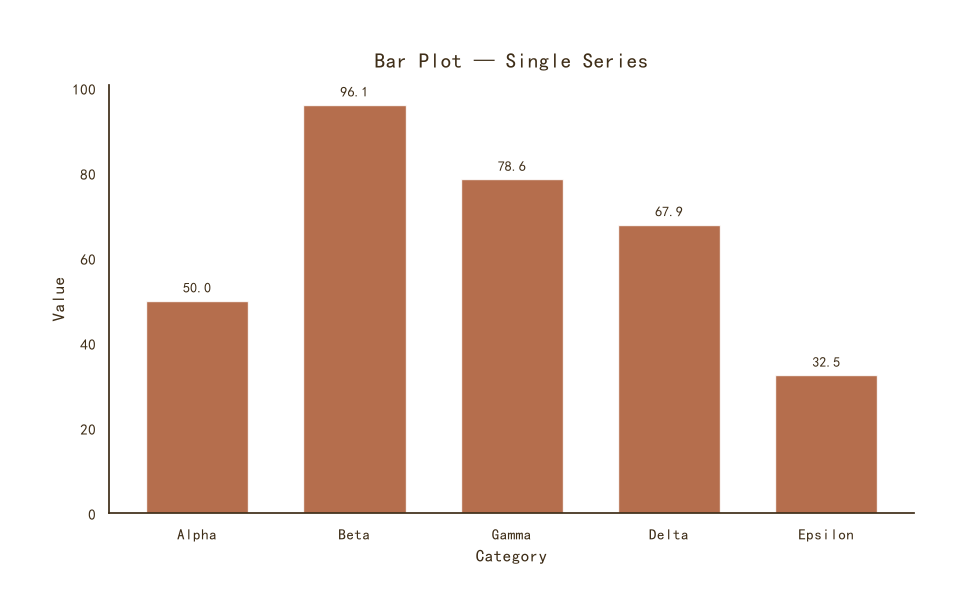
基础条形图(垂直)
Python37 行
import matplotlib.pyplot as plt
import numpy as np

COLORS = ["#A8552E", "#35666E", "#D0A64F", "#3F2E18", "#7E8F52"]
BG = "#F7F3EC"

np.random.seed(42)
categories = ["Alpha", "Beta", "Gamma", "Delta", "Epsilon"]
values = np.random.uniform(20, 100, len(categories))

fig, ax = plt.subplots(figsize=(9, 5.5))

bars = ax.bar(categories, values,
              color=COLORS[0], alpha=0.85,
              edgecolor="white", linewidth=1.0,
              width=0.65)

# 柱顶标数值
for bar in bars:
    h = bar.get_height()
    ax.text(bar.get_x() + bar.get_width() / 2, h + 1.5,
            f"{h:.1f}", ha="center", va="bottom",
            fontsize=10, color=COLORS[3])

ax.set_title("Bar Plot — Single Series", fontsize=15,
             color=COLORS[3], pad=12)
ax.set_xlabel("Category", fontsize=12, color=COLORS[3])
ax.set_ylabel("Value", fontsize=12, color=COLORS[3])
ax.tick_params(axis="both", colors=COLORS[3])

for s in ("top", "right"):
    ax.spines[s].set_visible(False)
ax.spines["left"].set_color(COLORS[3])
ax.spines["bottom"].set_color(COLORS[3])

plt.tight_layout()
plt.show()按值排序 + 颜色映射
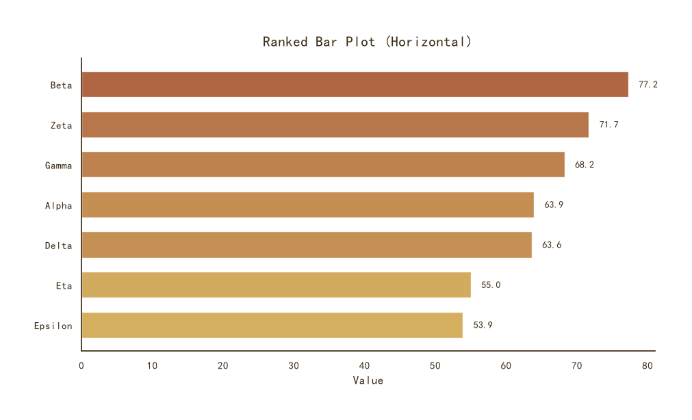
按值排序 + 颜色映射
Python49 行
import matplotlib.pyplot as plt
import numpy as np
from matplotlib.colors import LinearSegmentedColormap

BG = "#F7F3EC"
CMAP = LinearSegmentedColormap.from_list(
    "theme", ["#D0A64F", "#A8552E"], N=256
)

np.random.seed(0)
categories = ["Alpha", "Beta", "Gamma", "Delta", "Epsilon", "Zeta", "Eta"]
values = np.random.uniform(20, 100, len(categories))

# 排序
order = np.argsort(values)[::-1]
cats_sorted = [categories[i] for i in order]
vals_sorted = values[order]

# 按值映射颜色
norm = (vals_sorted - vals_sorted.min()) / (vals_sorted.max() - vals_sorted.min())
colors = [CMAP(v) for v in norm]

fig, ax = plt.subplots(figsize=(9.5, 5.5))

bars = ax.barh(cats_sorted, vals_sorted,
               color=colors, alpha=0.9,
               edgecolor="white", linewidth=1.0,
               height=0.65)

# 数值标注在条形末端
for bar in bars:
    w = bar.get_width()
    ax.text(w + 1.5, bar.get_y() + bar.get_height() / 2,
            f"{w:.1f}", va="center", ha="left",
            fontsize=10, color="#3F2E18")

ax.set_title("Ranked Bar Plot (Horizontal)", fontsize=15,
             color="#3F2E18", pad=12)
ax.set_xlabel("Value", fontsize=12, color="#3F2E18")
ax.tick_params(axis="both", colors="#3F2E18")
ax.invert_yaxis()   # 最大值在顶部

for s in ("top", "right"):
    ax.spines[s].set_visible(False)
ax.spines["left"].set_color("#3F2E18")
ax.spines["bottom"].set_color("#3F2E18")

plt.tight_layout()
plt.show()分组条形图
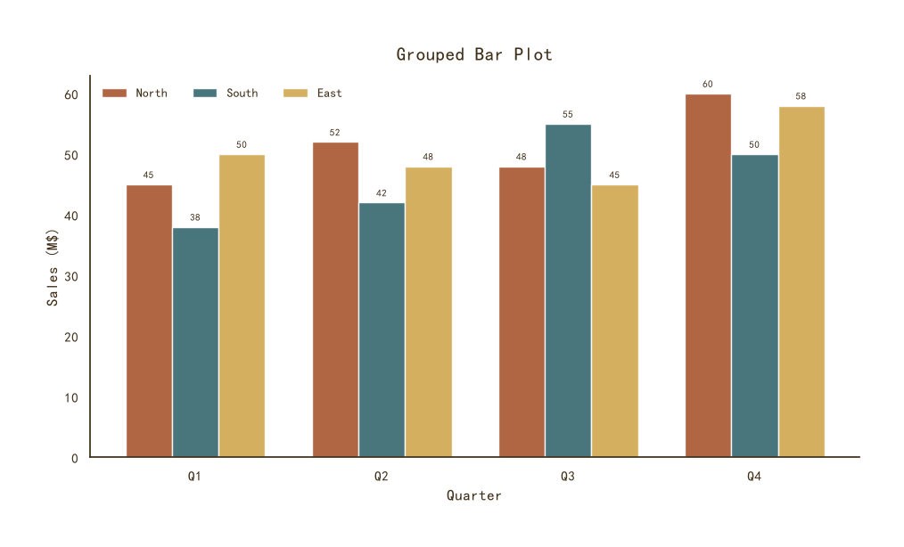
分组条形图
Python49 行
import matplotlib.pyplot as plt
import numpy as np

COLORS = ["#A8552E", "#35666E", "#D0A64F", "#3F2E18", "#7E8F52"]
BG = "#F7F3EC"

np.random.seed(1)
categories = ["Q1", "Q2", "Q3", "Q4"]
series = {
    "North": [45, 52, 48, 60],
    "South": [38, 42, 55, 50],
    "East":  [50, 48, 45, 58],
}

x = np.arange(len(categories))
n = len(series)
width = 0.25

fig, ax = plt.subplots(figsize=(9.5, 5.5))

for i, ((name, vals), c) in enumerate(zip(series.items(), COLORS)):
    offset = (i - (n - 1) / 2) * width
    bars = ax.bar(x + offset, vals, width=width,
                  color=c, alpha=0.9,
                  edgecolor="white", linewidth=1.0,
                  label=name)
    for bar in bars:
        h = bar.get_height()
        ax.text(bar.get_x() + bar.get_width() / 2, h + 0.8,
                f"{h:.0f}", ha="center", va="bottom",
                fontsize=8, color=COLORS[3])

ax.set_xticks(x)
ax.set_xticklabels(categories)
ax.set_title("Grouped Bar Plot", fontsize=15,
             color=COLORS[3], pad=12)
ax.set_xlabel("Quarter", fontsize=12, color=COLORS[3])
ax.set_ylabel("Sales (M$)", fontsize=12, color=COLORS[3])
ax.tick_params(axis="both", colors=COLORS[3])
ax.legend(frameon=False, fontsize=10, labelcolor=COLORS[3],
          loc="upper left", ncol=3)

for s in ("top", "right"):
    ax.spines[s].set_visible(False)
ax.spines["left"].set_color(COLORS[3])
ax.spines["bottom"].set_color(COLORS[3])

plt.tight_layout()
plt.show()堆叠条形图
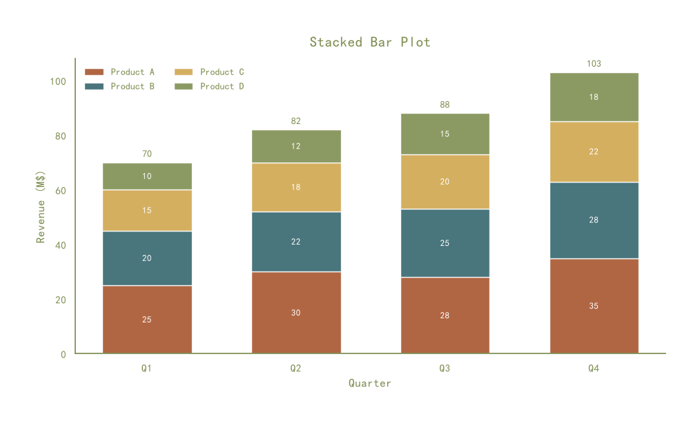
堆叠条形图
Python58 行
import matplotlib.pyplot as plt
import numpy as np

COLORS = ["#A8552E", "#35666E", "#D0A64F", "#7E8F52", "#3F2E18"]
BG = "#F7F3EC"

np.random.seed(2)
categories = ["Q1", "Q2", "Q3", "Q4"]
series = {
    "Product A": [25, 30, 28, 35],
    "Product B": [20, 22, 25, 28],
    "Product C": [15, 18, 20, 22],
    "Product D": [10, 12, 15, 18],
}

x = np.arange(len(categories))
bottom = np.zeros(len(categories))

fig, ax = plt.subplots(figsize=(9.5, 5.5))

for (name, vals), c in zip(series.items(), COLORS):
    vals = np.array(vals)
    bars = ax.bar(x, vals, bottom=bottom, width=0.6,
                  color=c, alpha=0.9,
                  edgecolor="white", linewidth=1.0,
                  label=name)
    # 段内标数值
    for bar, v in zip(bars, vals):
        if v > 5:
            ax.text(bar.get_x() + bar.get_width() / 2,
                    bar.get_y() + bar.get_height() / 2,
                    f"{v:.0f}", ha="center", va="center",
                    fontsize=9, color="white", fontweight="bold")
    bottom += vals

# 总量标注
for xi, total in zip(x, bottom):
    ax.text(xi, total + 1.5, f"{total:.0f}",
            ha="center", va="bottom",
            fontsize=10, color=COLORS[3], fontweight="bold")

ax.set_xticks(x)
ax.set_xticklabels(categories)
ax.set_title("Stacked Bar Plot", fontsize=15,
             color=COLORS[3], pad=12)
ax.set_xlabel("Quarter", fontsize=12, color=COLORS[3])
ax.set_ylabel("Revenue (M$)", fontsize=12, color=COLORS[3])
ax.tick_params(axis="both", colors=COLORS[3])
ax.legend(frameon=False, fontsize=10, labelcolor=COLORS[3],
          loc="upper left", ncol=2)

for s in ("top", "right"):
    ax.spines[s].set_visible(False)
ax.spines["left"].set_color(COLORS[3])
ax.spines["bottom"].set_color(COLORS[3])

plt.tight_layout()
plt.show()带误差棒的条形图
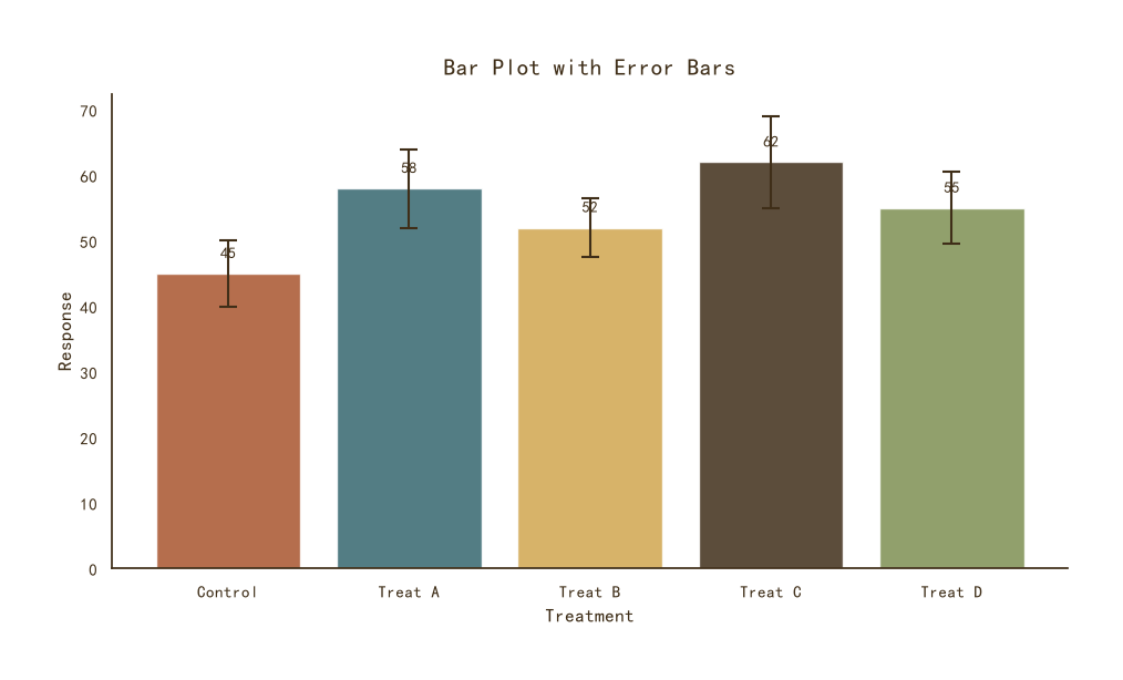
带误差棒的条形图
Python41 行
import matplotlib.pyplot as plt
import numpy as np

COLORS = ["#A8552E", "#35666E", "#D0A64F", "#3F2E18", "#7E8F52"]
BG = "#F7F3EC"

np.random.seed(3)
categories = ["Control", "Treat A", "Treat B", "Treat C", "Treat D"]
means = np.array([45, 58, 52, 62, 55])
stds = np.array([5, 6, 4.5, 7, 5.5])

fig, ax = plt.subplots(figsize=(9.5, 5.5))

bars = ax.bar(categories, means,
              yerr=stds,
              color=COLORS[:len(categories)], alpha=0.85,
              edgecolor="white", linewidth=1.0,
              capsize=6,
              error_kw=dict(ecolor=COLORS[3], elinewidth=1.5,
                            capthick=1.5))

# 柱顶标数值
for bar, m in zip(bars, means):
    ax.text(bar.get_x() + bar.get_width() / 2,
            bar.get_height() + 2,
            f"{m:.0f}", ha="center", va="bottom",
            fontsize=10, color=COLORS[3])

ax.set_title("Bar Plot with Error Bars", fontsize=15,
             color=COLORS[3], pad=12)
ax.set_xlabel("Treatment", fontsize=12, color=COLORS[3])
ax.set_ylabel("Response", fontsize=12, color=COLORS[3])
ax.tick_params(axis="both", colors=COLORS[3])

for s in ("top", "right"):
    ax.spines[s].set_visible(False)
ax.spines["left"].set_color(COLORS[3])
ax.spines["bottom"].set_color(COLORS[3])

plt.tight_layout()
plt.show()