PIE
绘图 · 第 24 / 36 章
基础饼图
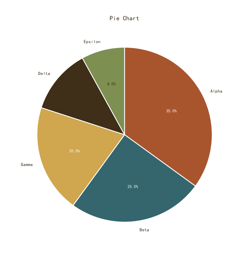
基础饼图
Python33 行
import matplotlib.pyplot as plt
import numpy as np

COLORS = ["#A8552E", "#35666E", "#D0A64F", "#3F2E18", "#7E8F52"]
BG = "#F7F3EC"

labels = ["Alpha", "Beta", "Gamma", "Delta", "Epsilon"]
values = [35, 25, 20, 12, 8]

fig, ax = plt.subplots(figsize=(8, 8))

wedges, texts, autotexts = ax.pie(
    values,
    labels=labels,
    colors=COLORS[:len(values)],
    autopct="%1.1f%%",
    startangle=90,
    counterclock=False,
    wedgeprops=dict(edgecolor="white", linewidth=2.0),
    textprops=dict(color=COLORS[3], fontsize=11),
)

# 百分比文字颜色自适应
for i, at in enumerate(autotexts):
    at.set_color("white" if i < 3 else COLORS[3])
    at.set_fontsize(10)
    at.set_fontweight("bold")

ax.set_title("Pie Chart", fontsize=15, color=COLORS[3], pad=12)
ax.set_aspect("equal")   # 保证是正圆

plt.tight_layout()
plt.show()带数值标注
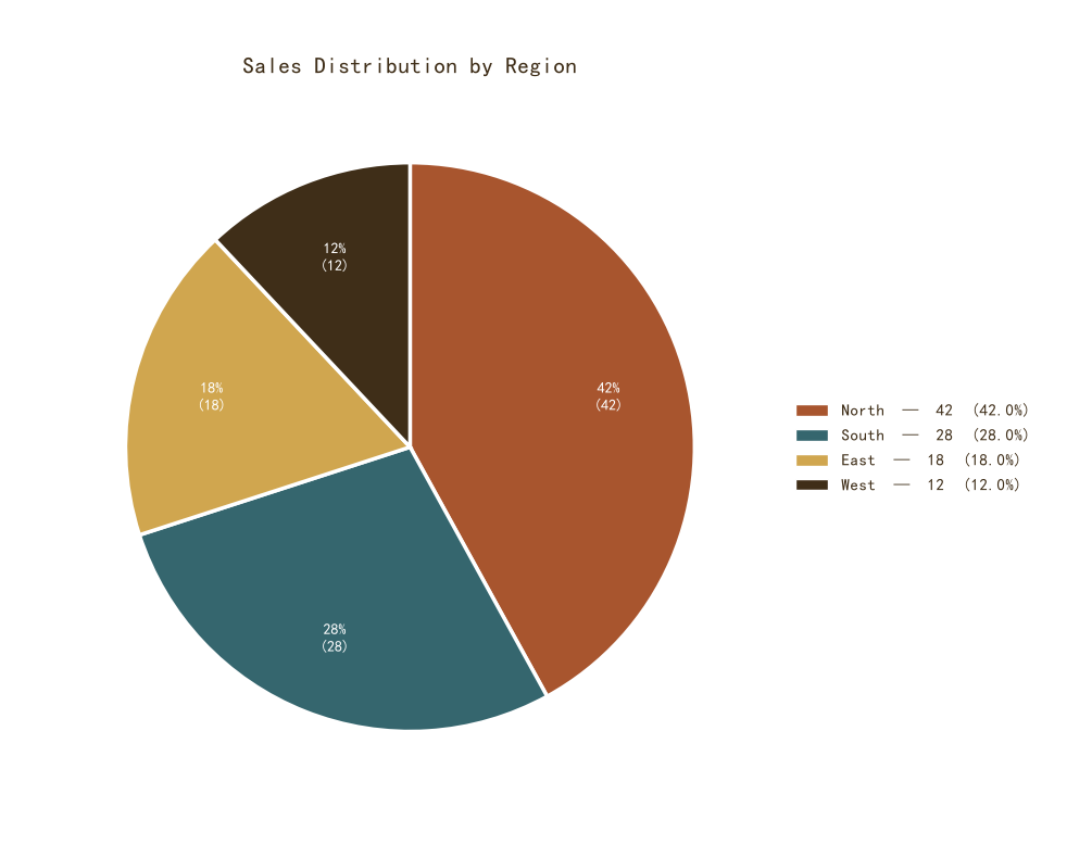
带数值标注
Python39 行
import matplotlib.pyplot as plt
import numpy as np

COLORS = ["#A8552E", "#35666E", "#D0A64F", "#3F2E18", "#7E8F52"]
BG = "#F7F3EC"

labels = ["North", "South", "East", "West"]
values = [42, 28, 18, 12]
total = sum(values)

fig, ax = plt.subplots(figsize=(9, 8))

wedges, texts, autotexts = ax.pie(
    values,
    labels=None,                       # 标签移到图例
    colors=COLORS[:len(values)],
    autopct=lambda p: f"{p:.0f}%\n({p * total / 100:.0f})",  # 百分比 + 绝对值
    startangle=90,
    counterclock=False,
    pctdistance=0.72,
    wedgeprops=dict(edgecolor="white", linewidth=2.5),
    textprops=dict(color="white", fontsize=10, fontweight="bold"),
)

ax.set_title("Sales Distribution by Region",
             fontsize=15, color=COLORS[3], pad=12)

# 图例(含数值)
from matplotlib.patches import Patch
handles = [Patch(facecolor=c, edgecolor="white",
                 label=f"{name}  —  {v}  ({v/total*100:.1f}%)")
           for name, v, c in zip(labels, values, COLORS)]
ax.legend(handles=handles, frameon=False, fontsize=11,
          labelcolor=COLORS[3], loc="center left",
          bbox_to_anchor=(1.02, 0.5))

ax.set_aspect("equal")
plt.tight_layout()
plt.show()突出显示某一扇区
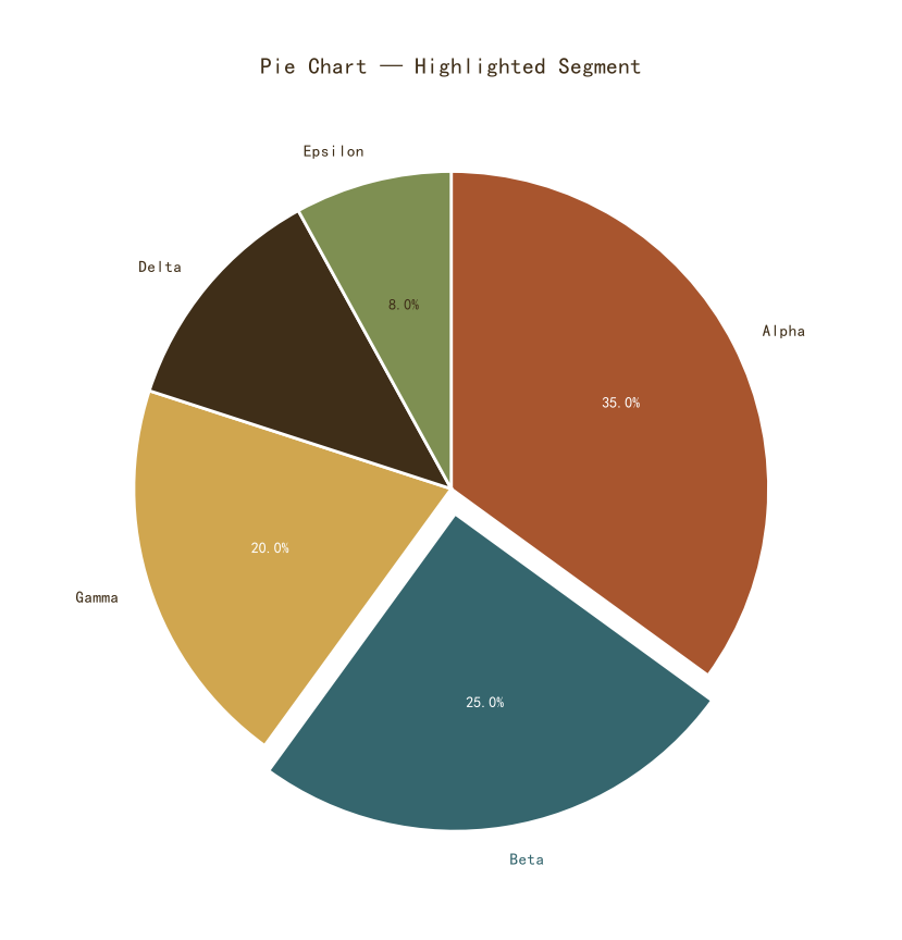
突出显示某一扇区
Python42 行
import matplotlib.pyplot as plt
import numpy as np

COLORS = ["#A8552E", "#35666E", "#D0A64F", "#3F2E18", "#7E8F52"]
BG = "#F7F3EC"

labels = ["Alpha", "Beta", "Gamma", "Delta", "Epsilon"]
values = [35, 25, 20, 12, 8]

# 只突出 Beta(索引 1)
explode = [0, 0.08, 0, 0, 0]

fig, ax = plt.subplots(figsize=(8.5, 8))

wedges, texts, autotexts = ax.pie(
    values,
    labels=labels,
    explode=explode,
    colors=COLORS[:len(values)],
    autopct="%1.1f%%",
    startangle=90,
    counterclock=False,
    shadow=False,
    wedgeprops=dict(edgecolor="white", linewidth=2.0),
    textprops=dict(color=COLORS[3], fontsize=11),
)

# 突出扇区的文字加粗
texts[1].set_fontweight("bold")
texts[1].set_color(COLORS[1])
autotexts[1].set_fontweight("bold")

for i, at in enumerate(autotexts):
    at.set_color("white" if i < 3 else COLORS[3])
    at.set_fontsize(10)

ax.set_title("Pie Chart — Highlighted Segment",
             fontsize=15, color=COLORS[3], pad=12)
ax.set_aspect("equal")

plt.tight_layout()
plt.show()带引导线的饼图(标签在外部)
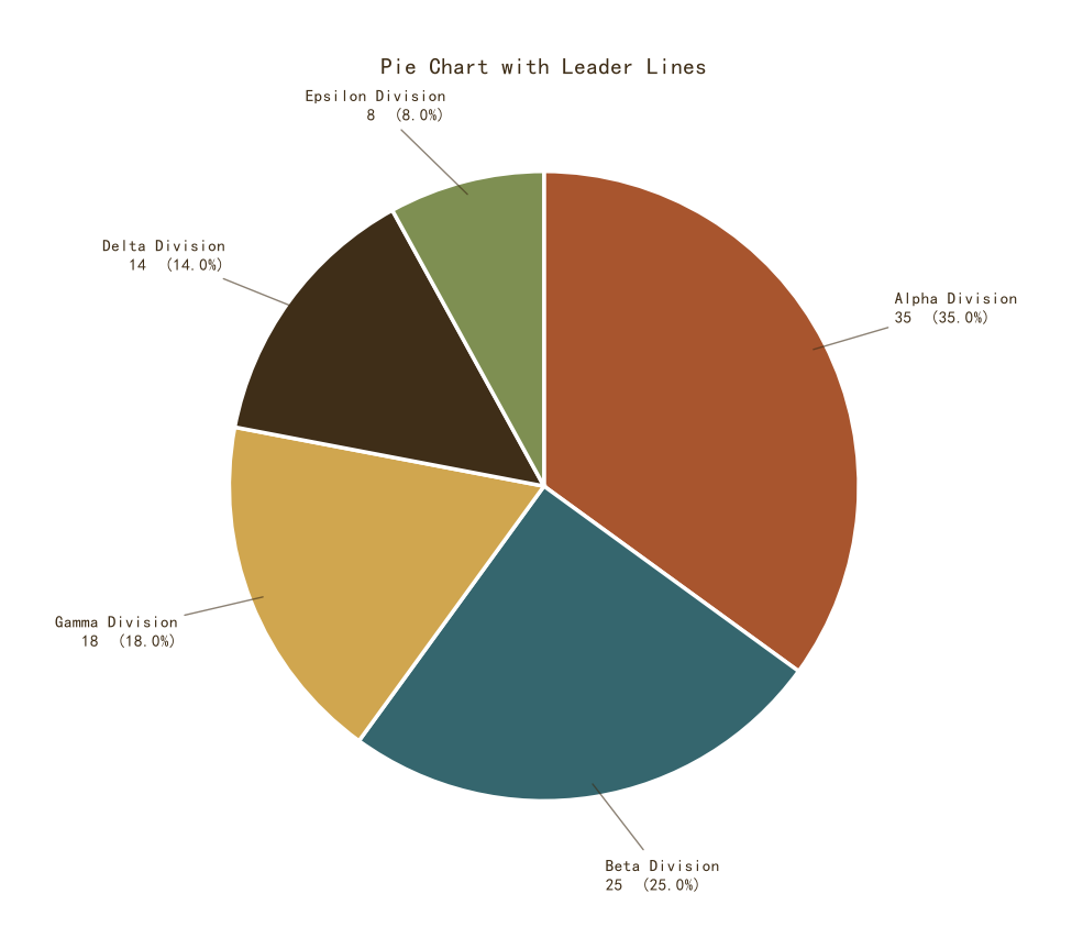
带引导线的饼图(标签在外部)
Python46 行
import matplotlib.pyplot as plt
import numpy as np

COLORS = ["#A8552E", "#35666E", "#D0A64F", "#3F2E18", "#7E8F52"]
BG = "#F7F3EC"

labels = ["Alpha Division", "Beta Division",
          "Gamma Division", "Delta Division", "Epsilon Division"]
values = [35, 25, 18, 14, 8]
total = sum(values)

fig, ax = plt.subplots(figsize=(10, 8))

wedges, _ = ax.pie(
    values,
    labels=None,
    colors=COLORS[:len(values)],
    startangle=90,
    counterclock=False,
    wedgeprops=dict(edgecolor="white", linewidth=2.5),
)

# 手动加外部标签 + 引导线
for wedge, label, val in zip(wedges, labels, values):
    ang = (wedge.theta2 + wedge.theta1) / 2
    x = np.cos(np.deg2rad(ang))
    y = np.sin(np.deg2rad(ang))

    ax.annotate(
        f"{label}\n{val}  ({val / total * 100:.1f}%)",
        xy=(0.95 * x, 0.95 * y),
        xytext=(1.25 * x, 1.25 * y),
        ha="left" if x >= 0 else "right",
        va="center",
        fontsize=11,
        color=COLORS[3],
        arrowprops=dict(arrowstyle="-", color=COLORS[3],
                        linewidth=1.0, alpha=0.6),
    )

ax.set_title("Pie Chart with Leader Lines",
             fontsize=15, color=COLORS[3], pad=12)
ax.set_aspect("equal")

plt.tight_layout()
plt.show()